 FA+
FA+

Adding definition to your art.
Posted 14 years agoThis was brought up on another forum so I thought I would post it here. A common thing artists overlook is adding depth to the color of their works to bring out the definition of the subject. See the example below. I'm not sure who did the original. I just googled "Furry" and it was in the image list.
http://img.photobucket.com/albums/v.....ColorDepth.jpg
Notice how the second frame while still the same color, stands out more and seems more complex? See how noticeable the smaller details are compared to the first one where they all just kind of wash together?
I did this in just a few seconds by duplicating the layer, Layer>Duplicate Layer.
I went to Image>Adjustment>Levels and moved the gray slider more towards the white end of the spectrum. This darkened the duplicated layer significantly.
Now go to Layer>Layer Mask>Hide all. This will hide the layer you made dark revealing the unaltered original work.
When you create a layer mask what this does is attach a black or white square in the layer window too it which hides or reveals the masked layer depending on how much white is on that square. So make sure you click the mask, not the image, and then paint in white with a brush. Paint in some areas you would like darker contrast in the fur or clothing. You don't have to be overly neat with it because we will be messing with it more in the next step. I recommend using a paint brush with a flow set to 70-80% so you don't get a universally dark color everywhere but instead various levels of richness.
For the final masking step click on the mask and use Filter>Blur>Gaussian Blur then play with the slider until you get the effect you want. By having the Mask selected and not the image you leave the image unchanged but instead blur the black and white mask which tells Photoshop where to darken things. This, again, makes things seem more organic and natural. No natural color is 100% absolute. There are subtle shades of color in everything.
When you are happy select the original layer duplicate it. Hide the original layer so you can save the archived copy. (This is important. Always keep a PSD with an archive of your original works.)
Shift Select the two new layers and do Layer>Merge Layers. Now you can save them out and post the more enjoyable image.
Now, once you have this technique down for using levels you can also use it for other things. Like for example instead of levels you can do Image>Adjustments>Hue/Saturation and make a duplicate layer more vibrant with color (turning up the saturation) and then painting in brighter colors and using the blur function to blend them.
For example: http://img.photobucket.com/albums/v.....y_askerian.jpg
This is another random image grabbed from google. The original artist had the sense to put their name on this one.
So sharp it cuts.
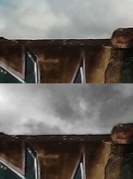
Posted 14 years agoI was looking at http://www.furaffinity.net/full/6430125/ which is a great work but I noticed something a lot of 3d artists do that I know a fix for so I thought I would share. It's a compositing trick I learned a while back. I made this image to demonstrate what I'm talking about.
http://img.photobucket.com/albums/v....._2700_1350.jpg
Along the top of the wall in the original work there is a line a few pixels thick of white fringe where the image was sharpened at some point. This pits the wall against the skyline in sharp contrast and distracts from the subject of the work.
To fix this while you are compositing the image open Photoshop, select the offending layer and at the top menu go to Layer>Matting.
There are three options commonly available with any image.
* Defringe - This lets you just shave off how ever many pixels you choose from the border of the layer.
* Remove white matting - This will attempt to shave off only pixels which are common with white noise distortion.
* Remove black matting - This will do the same but for black pixels.
In -most- cases I run white, then black. Some times if the color information is damaged I do it manually but it really depends on what looks best on the piece you are composing try them all out. So now you have your layer all free of distortion but if you leave it like that then you will have a very sharp cut from one layer to another. It will make the transition between images look unnatural so part two of the trick is...
Duplicate the layer you just removed the frindge of, put it under the one you just worked on. Name the new layer Blur_2px because that is what you are going to do to it. You take that layer and use Filter>Blur>Gaussian Blur. Blur the layer by 2 pixels. Because it is under the visible layer it just becomes a transition which goes from your sharp clear image to the background.
If you have a REALLY high def image you are working on you can duplicate the main layer again, put that one under the Blur_2px and make it a Blur_4px but set the fill to 50% so you get a truly gradual transition from one composite layer to another. In most cases Blur_2 is enough.