 FA+
FA+
587
Views
Views
47
Favorites
Favorites
Category
Artwork (Digital) / General Furry Art
Species Unspecified / Any
Size 638 x 878
File Size 221.9 kB
Report this content
More from TheRGHU


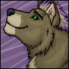
Ooookay. So At this point I've added the rest of the figures lines. I've also added a bit more light value as well as darker value.
So take note here, I used a green background and then with an alternate layer I drew out the image how i wanted it. After that I went back to my gren layer and started to use the dodge tool, using the air/paint brush with the opacity set to pen pressure is also effective if I had used white instead, this is up to however you choose :]
after filling in most of the light value, Since I couldn't recall the contrasting color to green, I used purple for the shadows. This is on a layed between the linework and background. I do this in case i want to see the light values alone or the dark values alone, it gives me more freedom to mess with the image and get a different perspective on it.
I'll post the next step when i get there. Hope this is useful to.. well. someone :D
Category Artwork (Digital) / General Furry Art
Species Unspecified / Any
Size 638 x 878px
File Size 221.9 kB


Honestly I used a straight purple but i used the medium one on the photoshop colorwheel. I didnt say so before but what I did was set the brush setting to have to opacity on pen pressure. So when i pressed lightly, the purple was lighter, when i pressed harder the purple was darker. but mess around with it, you may find something else works better for you!

Looking good so far! The compliment to green is red, by the way, though the purple looks fine. One of the easiest ways to get a compliment is to set all the sliders (except black in CMYK) to the opposite of what they are. So if the Cyan is set to 36, slide it to 64, etc.


Thanks! I agree, digital arts is hards o.o
But I'll admit, I had a really good teacher. We're not on speaking terms but as an artist I still respect them. It's because of their willingness to teach that I decided I may as well help out anyone else who found this as hard and annoying as I did. perhaps one day when I figure it out I will post a tutorial from start to finish ;3
But I'll admit, I had a really good teacher. We're not on speaking terms but as an artist I still respect them. It's because of their willingness to teach that I decided I may as well help out anyone else who found this as hard and annoying as I did. perhaps one day when I figure it out I will post a tutorial from start to finish ;3

Comments